2018 Website Design Trends

The web site is a unique environment which is constantly changing and evolving and keeping that in mind Tech Cybers gives you a brief description about the website design trends 2017.
1. Mobile-first approach
As the name suggests, mobile-first design is the process of designing for mobile (or smallest screened devices) first, then working up to the bigger ones. Nowadays mobile phones are most used devices for browsing the websites especially in Dubai. The mobile-first approach to design isn’t new to 2016 and has been around for a few years. Design and visuals aside, the mobile-first model and the restrictions it brings is a useful way for brands to really consider what their core content and message is that they want to communicate.

2. Wide Layout implementation of responsive design
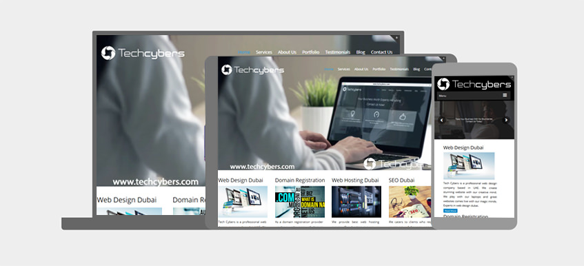
Responsive design is also something which has been around for a few years, what we predict to see over the coming year is an even bigger uptake in the number of brands, both big and small, who are building responsive-based sites.
One of the main benefits of responsive design is that it allows businesses to pay for just a single site build which effectively delivers content on mobile and tablet, all the way to laptops to big-screened desktops.

Rankings aside, what’s also interesting to note is how user behavior has changed over the last couple of years. Internet users have quickly taken to mobile-optimized sites which make their browsing experience easier, and any site which now doesn’t meet these standards simply won’t cut it. As this info graphic from Experience Dynamics shows, 79% of users will leave the site they’re browsing and find another if it isn’t optimised – something for brands to really consider!
3. Richer background and patterns and background images
Especially common is the grid pattern, which is treated as a “frame” for the other elements of the layout. Those elements are moved over the grid on the parallax principle and often are arranged in a chaotic manner. Usage of good and clean background images with less but informative content is a great way to attract users

4. Design Frameworks and UI Patterns
What we’re starting to see more and more are both UI and UX patterns emerge across the web where many sites look and function in very similar ways as they learn from one another to hone their user’s experience. With so much online competition today for brands across all sectors, they can’t afford to take major risks in their user’s journey, and if these tried-and-tested patterns and principles work, it makes sense to use them (where appropriate!) to enhance their site.
As these existing UI and UX patterns evolve and develop, we’ll see more and more brand’s implementing them as we move one step closer to a more unified, and consistent online browsing experience.
5. Unique layouts
Over dramatic as the web-design-is-dead argument may be, you can’t blame any creative for seeking innovative ways to present content to readers. And one of the most enticing methods for breaking out of the box-centric layouts many blame responsive design for is the broken grid.
This approach seeks a way out of the meticulously aligned and “boxy” layouts we’ve been seeing a lot of lately with a variety of what might seem like visually jarring techniques.
6. Brighter color
Brighter color can attract users to your web site and it gives more clarity. Using good and clean colors can attract users. It’s not just about bright, enthusiastic color either. Gradients also came back in a big way, blending and blurring those exuberant hues into spectra reminiscent of a noonday sky or a splashy sunset.
7. Focus more on animation
Animated sliders images and content is one of the best way to give users a wonderful experience. Nowadays animated contents and images are most usually seen in the top branded web sites.The latter characteristic will become particularly important as it becomes easier to create animations.
8. Video Background
In the web development industry, large video backgrounds are considered one of the most engaging ways to portray a company’s vision, mission and capabilities. More and more video content is being generated every day, and modern internet users often tend to prefer videos and images over plain text. As such, incorporating a video background in your web design can go a long way to bringing your design to life.
The most obvious benefit of having a video background on your website is that it makes up for visual presentation in an unobtrusive manner. Videos can tell stories that can otherwise not be described using static text content. This can add to the visual experience of your website and impress your visitors.
Like Us on Facebook:
Follow Us on Linkedin:
If you are looking for a web design dubai based company for your website design work, then you must contact us for a better web design deal. Choosing your web design dubai based company really matters for your company web design work.


